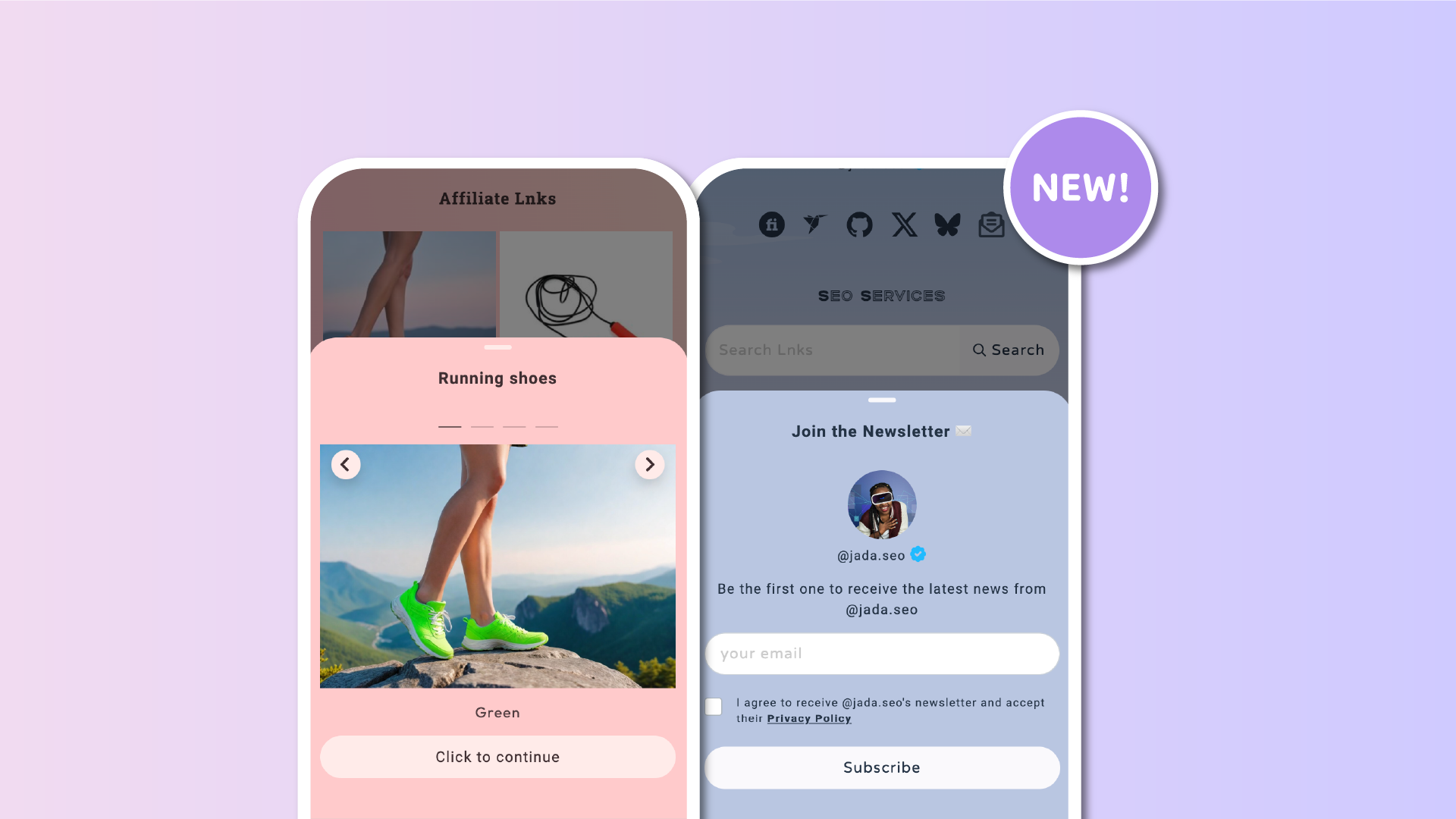
With an increasing number of Lnk.Bio functions relying on modal windows to open on your public linkinbio page (for example, the Multi Lnks, Carousel, Shop, Booking Calendar), it's important that the look and feel of these modal windows remains consistent with your main theme.
This need became very clear from your fantastic suggestions, which particularly highlighted the stark contrast between having a dark theme on your Lnk.Bio page and a white modal opening on top of it. Not good.
So today, we unveil a redesign for all your public modals which features seamless integration with your Lnk.Bio colors.
If your background is dark, the modals will feature a dark background; if you have green text on your Lnk.Bio page, the text in the modals will also be green. You get the gist.
This upgrade is already available for all accounts, from those using our free templates to Unique accounts with customized colors for each element.
As always, let us know what you think of this new development and if there's anything else we can improve.


