
Due to the many (many, many, many...) newsletter integrations we've released in the past few days, we felt that the old UI didn't provide the best experience for managing all the many (many, many, many...) new sync services we've made available.
Today, we unveil a complete redesign of the newsletter sync section. Here are the major improvements:
Redesigned Buttons and Icons
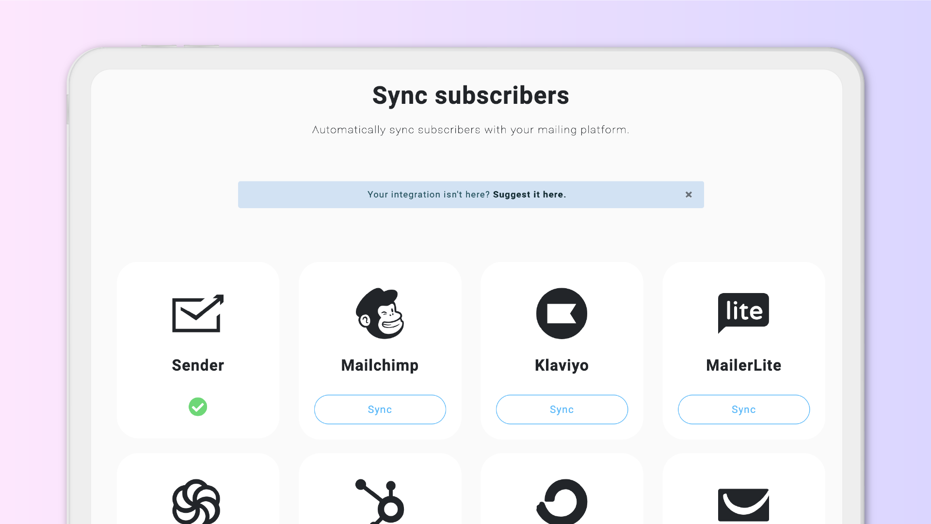
Each available integration now has its dedicated, large button with the logo and name of the platform, so you can quickly identify the one you're looking for. It looks super nice, I know.
Your Services at the Top
If you've already connected one or more services, they will appear at the top of the page, giving you quicker access to their settings, and you can immediately see which ones are active.
Most used at the top
If you don't have any connected services, they will be sorted based on the most used on Lnk.Bio first, so most probably you'll find the most common connections first.
Suggestions = growth
You know how much we love your suggestions, so we've moved the feedback notice to the top of the page, allowing you to immediately share if your desired connection is not available.
We truly hope these improvements positively impact your daily tasks and make your Lnk.Bio experience better