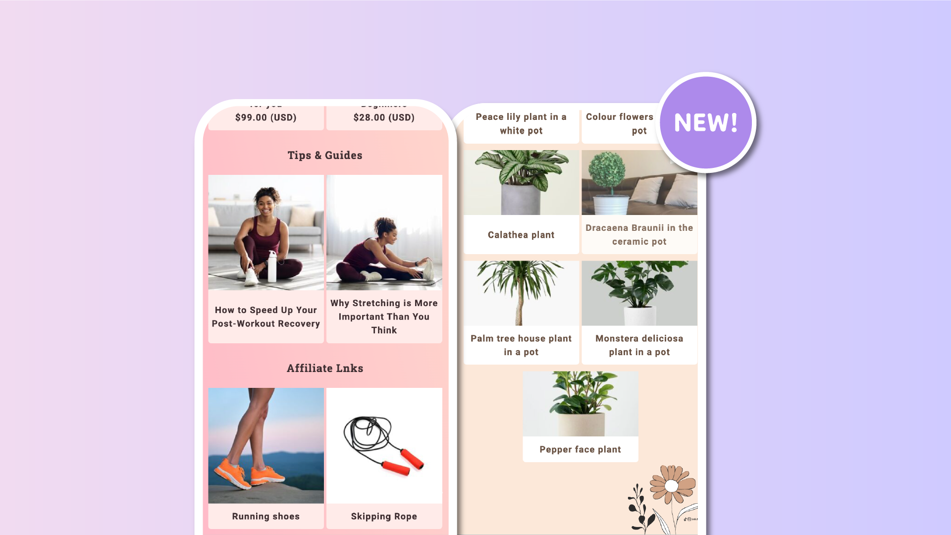
We’re constantly looking for ways to enhance your linkinbio experience and improve the visual consistency of your pages. In our latest update, we’ve addressed a common issue with grids: titles of different lengths often caused Lnks to appear uneven, resulting in a less polished look. This was also one of the most-voted features in our suggestions page.
With this update, we’ve introduced uniform Lnk heights for a balanced look, even with different title sizes. Now, regardless of whether a title is one line or two (or even more), all posts on the same row will have a uniform height. Titles are also perfectly centered within their designated space, creating a cohesive and aesthetically pleasing grid layout.
Where it’s applied
This improvement is automatically applied across all grid types on Lnk.Bio, including:
• Squared Grids
• Rectangular Grids
• Old Style Grids
Best of all, this update works seamlessly across both mobile and desktop views, ensuring your page looks sharp and well-organized on any device.
No action required
The best part? You don’t need to do anything to enable this feature! It has already been rolled out across all Lnk.Bio accounts. Simply continue creating and editing your Lnks as usual, and enjoy the new, more uniform grid display.
We’re excited to bring this enhancement to your Lnk.Bio page and look forward to seeing how it helps showcase your content in a more polished and professional way.
If you have other suggestions to make linkinbio pages even more beautiful, never hesitate to let us know.


